Dear Jonathan Anderson,
You ignite the fire of my life.
Your fan forever,
Lois xx
So, a quick recap to remind y'all of how fantastic last season J.W. Anderson was, via the
ugh amazing campaign:
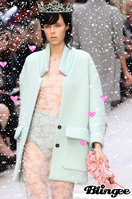
And I gotta tell you, I was nervous heading to style.com yesterday morning to check out the new show ~something about lightning not striking the same spot twice~ But it turns out I needn't have worried, because for the entire show (or in other words, for the entire slideshow) I was all
be still my beating heart. It was a magical, magical collection. It was that perfect, usually elusive marriage of fantasy and form.
It reminded me of John Galliano's graduate collection because of the similar calls to romantic peasantry via Vermeer vibes. But Anderson manages to be romantic and somewhat clinical and conceptual at the same time. How can romanticism and the experimental and the clinical merge? I have no idea but Anderson achieves it. Oh yeah, and even though these peasant silhouettes are practically a cliche now, Anderson manages to reimagine their construction to make them to feel new again.
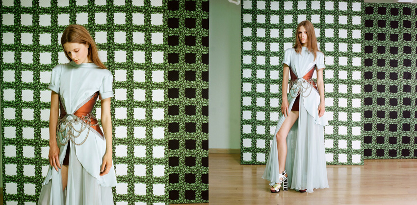
Even when he moved in less neu-peasantry directions and into the realm of colour, it was still cohesive. In recent Reddit
AMA fashion writer Robin Givhan said "when a designer puts on a show, they're essentially picking up a microphone: what did they say? Was it coherent or was it a jumble?" which is a wonderful way to consider and assess a collection as a whole, single statement. Which is what it is! Or at least it is when the designer elevates it more in the direction of art rather commercial (which has its place too). But to bring it back to J.W. Anderson, the collection's range felt broad but still absolutely cohesive. And, I will argue, equal parts wearable and absolutely not.
Those shiny skirts are going to fly off the shelves! (The trompe l'oeil camisoles not so much) And I actually want to swan around day to day in this blue look. But I just wanna say thanks Jonathan. Thank you so much for the beauty you bring to my world.
images from vogue.com